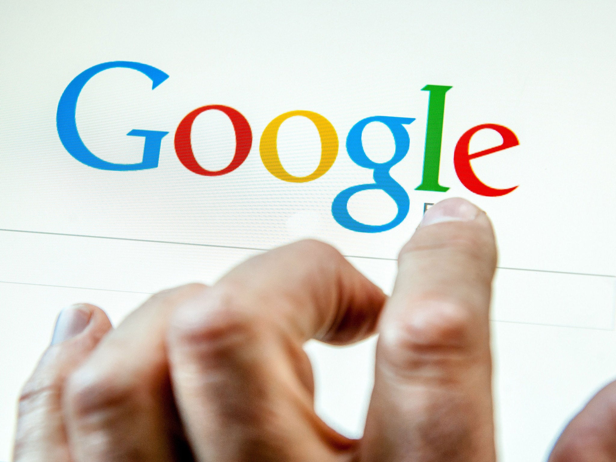
Google logo has changed: search giant unveils smooth new text to look good on tiny screens
Site says that the new, smooth text reflects the site's evolution

Google has revealed a new logo, smoothing the text into a new image that it says can more easily read on tiny screens.
The site has clipped off the curly serifs from the letters and instead replaced them with a much smoother look that it says "reflects [the] reality" of what the site is today. It also has slightly softer colours.
"As you’ll see, we’ve taken the Google logo and branding, which were originally built for a single desktop browser page, and updated them for a world of seamless computing across an endless number of devices and different kinds of inputs (such as tap, type and talk)," the company wrote in its blogpost announcing the change.
The new logo has already appeared on the homepage, with a little animation that wipes away the old logo and replaces it with the new one.
The change doesn't seem to be related to the company's re-organisation, which saw what used to be called Google changed into Alphabet. Though it is the first major change announced since then, Google's statement made no reference to the change and instead discussed the importance of shrinking the text for legibility on all kinds of screens.
But it does bring the look of Google in line with the more simple design of Alphabet.
Much more of Google's branding will be changed to match the new logo, it said. That included the little G that pops up when users click on the small microphone that Google sometimes shows.
Google noted that it had changed its logo multiple times over the last 17 years, and that it would be likely to change again. But it said the new change recast the logo "not just for the Google of today, but for the Google of the future".
Subscribe to Independent Premium to bookmark this article
Want to bookmark your favourite articles and stories to read or reference later? Start your Independent Premium subscription today.

Join our commenting forum
Join thought-provoking conversations, follow other Independent readers and see their replies