Pringles divides fans with ‘modern’ rebrand
‘The new look is so bad it’s hurtful,’ one fan says

Sign up to IndyEat's free newsletter for weekly recipes, foodie features and cookbook releases
Get our food and drink newsletter for free
Popular crisps brand Pringles has rebranded for the first time in 20 years, and fans are divided.
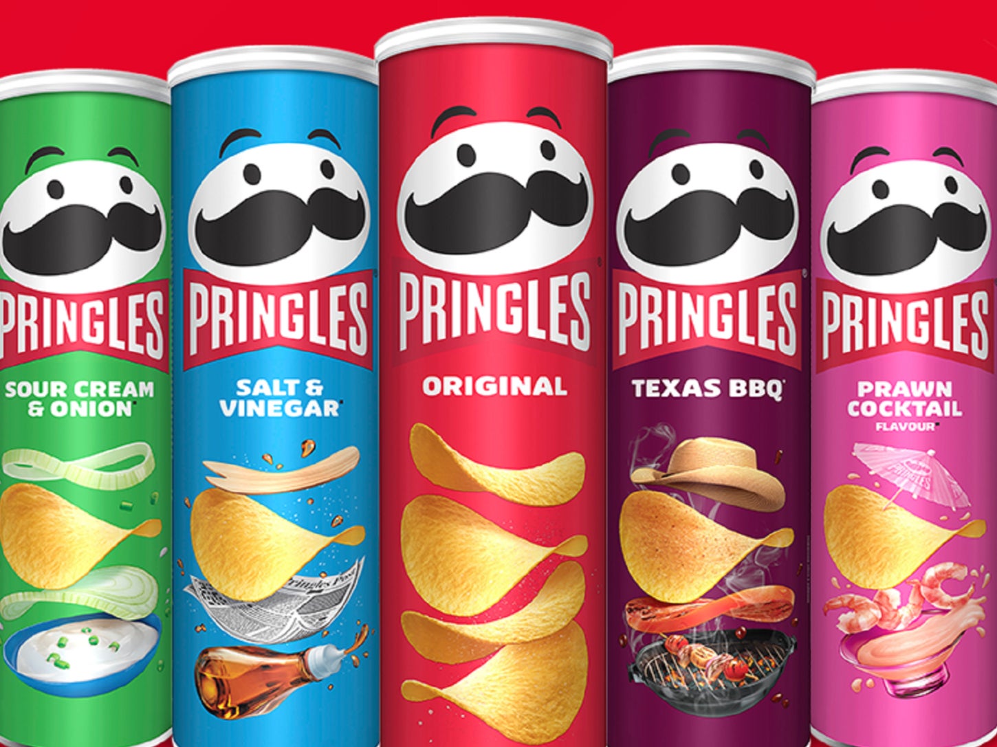
The snack’s mascot, “Mr P”, who appears on every tube, has been modernised to mark the 30th anniversary of the crisps’ UK launch.
While Mr P still sports his signature upturned moustache, it is now black instead of brown and he no longer has any hair.
The rebrand also forgoes his red bowtie, using a red and white logo instead.
“Mr P, our #Pringles mascot has had his first makeover in 20 years to coincide with the 30th anniversary of our UK launch.
“He will now sport a modern look, and at 54 years old, he is still looking as handsome as ever!” Pringles said in a tweet announcing the rebrand.
The mascot’s new look has divided fans, with some accusing Pringles’ parent company, Kellogg’s, of removing Mr P’s “character”.
“What is THIS. Since when does simplifying mean taking all the character out? Logos are getting more and more boring,” one tweet said.
Another person wrote: “Mr Pringles got a haircut and lost his bow in the new logo. He just doesn’t look as friendly. It kind of looks like a knockoff.”
A third said: “The new look is so bad it’s hurtful.”
Some people praised the rebrand, saying the packaging appears “more versatile and modern”.
“I really like this rebrand, they did a good job at keeping the distinctive character of the Pringles brand while also making the brand more versatile and modern,” one person tweeted.
Another Twitter user said: “Quite like this, a nice level of simplification, especially with the added personality. Only negative is that it no longer looks like my dad.”
Mr P has appeared on Pringles’ packaging since 1967. Since then, he has been rebranded six times.
Pringles is one of the most popular crisps brands in the UK, with five tubes sold every second.
Florence Kayll, brand manager at Pringles UK said the rebrand is Mr P’s “boldest look” yet.
“Mr P’s hair may now be gone but he’s looking more youthful than ever with striking new eyebrows and is of course still sporting his famous, stylish moustache as he celebrates his 30th birthday in the UK.
“While Mr P and the can design have both undergone a transformation, Brits can be confident that there are no changes to the amazing flavour and crunch found inside every Pringles can,” she said.
Subscribe to Independent Premium to bookmark this article
Want to bookmark your favourite articles and stories to read or reference later? Start your Independent Premium subscription today.
Join our commenting forum
Join thought-provoking conversations, follow other Independent readers and see their replies