Ryanair ditching aggressive yellow and 'Chelsea blue' colour scheme in rebrand push
Ryanair’s quest to move away from its low-cost, high-hassle reputation and win a 'posher' class of customer has now entered a new phase

Get the free Morning Headlines email for news from our reporters across the world
Sign up to our free Morning Headlines email
The airline has already dropped its hard-line cabin baggage allowance, reduced penalties for failing to print out boarding passes and introduced allocated seating.
But Ryanair’s quest to move away from its low-cost, high-hassle reputation and win a “posher” class of customer has now entered a new phase - with a small but revealing colour rebrand.
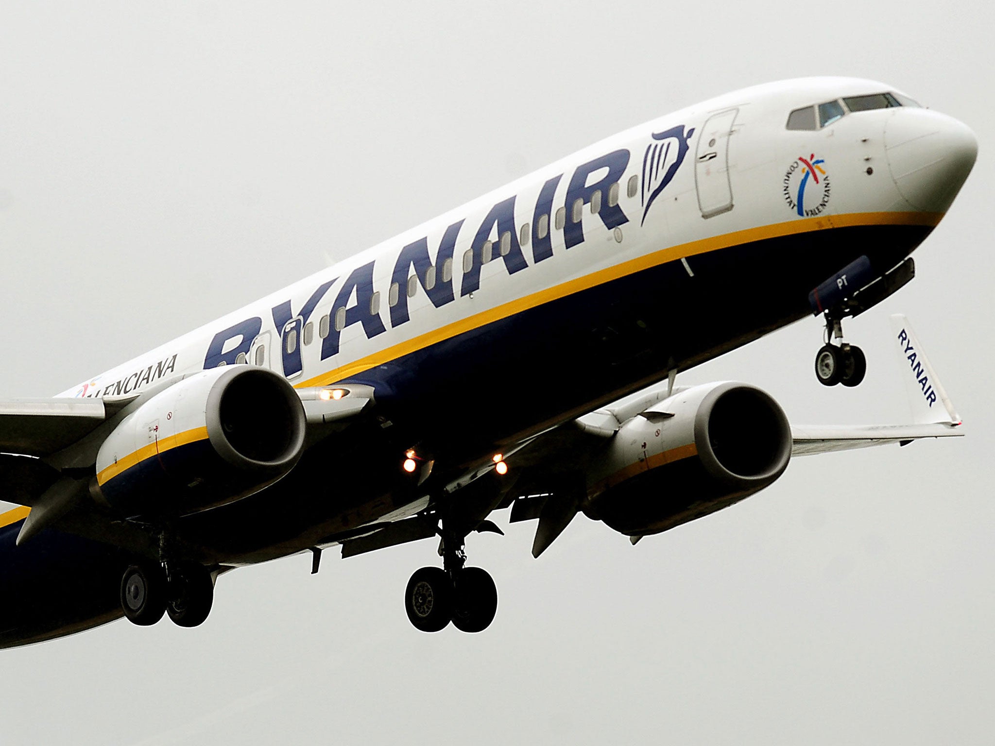
The brash “Chelsea blue” and aggressive yellow that have for years have defined the airline’s cheap and cheerful approach are to be toned down, it was announced this week. By making the blue in its uniforms and livery darker (it will now be a calmer “Spurs blue”) and reducing the quantity of bright yellow in its branding, Easyjet hopes to project a more serious and upmarket image.
The decision highlights the crucial role played by colour choice in the branding and packaging of products.
The bright, cheerful colours that used to represent Ryanair are used in much the same way by cutprice supermarkets such as Asda and Lidl, and by rival – and virulently orange – airline rival Easyjet to reinforce expectations of low prices.
“There’s a softening and modernising with the Ryanair brand. It was cheap and cheerful, no frills and ‘don’t talk to us about customer service’,” said Dr Chris Chapleo, a branding expert at Bournemouth University. “They have put their hands up and said ‘We’ve got some of it wrong’.
“Ryanair have had issues with their brand – though they are still a very successful company. These changes are part of them shifting their brand image.”
Colour in logos, liveries and packaging enable companies to win instant recognition by customers and to project emotive messages to them that enhance a reputation.
“Branding is how you are talked about when you aren’t in the room,” said Dr Chapleo. “Colour is part of the whole brand thing. Colour speaks volumes about the positioning and image.”
Colour branding can be so important that companies seek to protect the use of particular shades associated with their brand. Barclays and Boots have each copyrighted the shade of blue that makes them recognisable in high streets. Cadbury’s and Nestle have repeatedly locked horns over the use of purple that can indicate a luxury and indulgence.
He suspects, however, that the garish colours used by Ryanair and other businesses to indicate low cost value, could be on the way out of common usage. “Maybe it’s a sign they are modernising as a company,” he added.
Stefan Drew, a marketing consultant who presents himself as “the marketing magician”, said that supermarkets used colours to indicate their place in the market. While cut-price chains like Aldi tend to use brash colours (“They are very strong. They are eye-catching and they are meant to say ‘cheap’”), Waitrose and Marks & Spencer both use greens to indicate “tradition, prosperity, establishment – no one ever slates you for being green”.
Whether a change of colours can ever directly affect sales figures, however, is hard to quantify. “A lot of brand managers would say that if the numbers are going up it’s down to the brand recolouring,” Mr Drew said. “But it’s never that simple. There are always other things being done at the same time so you are never actually going to be able to measure whether it’s down to colours.”
Karen Haller, colour psychology expert, said: “Every brand should be thinking about the colours they use. Colour is the first thing you see – even before shape – in a logo and the first thing you have an emotional connection with. When companies change their brand colours, quite often it can mean that they are changing their values and they want a new look. If a company has negative press or can’t seem to shake off a bad image what can happen is they come up with a fresh look.”
Subscribe to Independent Premium to bookmark this article
Want to bookmark your favourite articles and stories to read or reference later? Start your Independent Premium subscription today.
Join our commenting forum
Join thought-provoking conversations, follow other Independent readers and see their replies